Introduction
A design system gives the developer sheet music to play from, complete with tempo, scores, and notation. Without it, every component improvises.
Design tokens are the score that keeps everything in rhythm, playing in time, and creating harmony across spacing, type, and layout.
Spacing — controlling rhythm
Spacing is the beat that holds a UI together. Every component — every padding, gap, and margin decision — reaches for spacing tokens.
Without a defined scale, the beat breaks down. A button gets 0.5rem padding, while a card gets an off-beat 14px. Each decision seems locally reasonable, but is globally inconsistent.
This system introduces a shared scale that covers the full range of layout needs.
:root {
    --spacing-xs:   0.25rem;    /*  4px */
    --spacing-sm:   0.5rem;     /*  8px */
    --spacing-md:   0.75rem;    /* 12px */
    --spacing-lg:   1rem;       /* 16px */
    --spacing-xl:   1.5rem;     /* 24px */
    --spacing-xxl:  2rem;       /* 32px */
    --spacing-3xl:  4rem;       /* 64px */
}
--spacing-xs
--spacing-sm
--spacing-md
--spacing-lg
--spacing-xl
--spacing-xxl
--spacing-3xl
Why these values?
The scale is built on increments of 0.25rem (4px) — small enough to be precise, large enough to be meaningful.
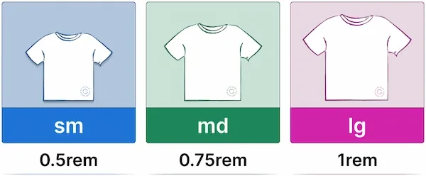
Each step is named using t-shirt sizing ( sm, md, lg etc. ) rather than numeric values, so names communicate scale at a glance rather than requiring mental conversion.
Where spacing tokens live in the system
Spacing tokens are consumed at every layer:
- Primitives use them for gap values between children
- Components use them for internal spacing ( margins, padding, gaps, and offsets )
From there, utility classes expose the same scale as composable helpers for one-off spacing needs.
The utility layer uses the same t-shirt sizing as the tokens - .gap-lg and --spacing-lg are clearly the same step in that scale.
/* gap.css */
.gap-sm { gap: var(--spacing-sm); }

/* padding.css */
.p-sm { padding: var(--spacing-sm); }

/* margin.css */
.m-sm { margin: var(--spacing-sm); }

/* ...full reference in resources */
Typography Scale — controlling readability
A type scale is like a musical key — everything plays in the same register. Without it, headings drift to slightly different sizes, line heights clash, and labels feel just a little too large. The composition breaks down quietly, one decision at a time.
Font sizes
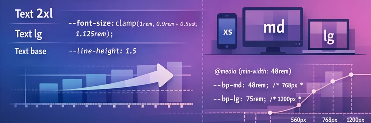
Each token uses clamp() to scale fluidly between a minimum and maximum value. Type stays readable at small viewport widths without becoming overwhelming at large ones — no media queries needed.
:root {
    --font-size-xs:   clamp(0.75rem,  0.7rem  + 0.25vw, 0.875rem);
    --font-size-sm:   clamp(0.875rem, 0.8rem  + 0.375vw, 1rem);
    --font-size-base: clamp(1rem,     0.9rem  + 0.5vw,   1.125rem);
    --font-size-lg:   clamp(1.125rem, 1rem    + 0.625vw, 1.25rem);
    --font-size-xl:   clamp(1.25rem,  1rem    + 0.75vw,  1.5rem);
    --font-size-xxl:  clamp(1.4rem,   1rem    + 1vw,     1.875rem);
    --font-size-3xl:  clamp(1.75rem,  1.25rem + 1.375vw, 2.25rem);
    --font-size-4xl:  clamp(1.85rem,  1.25rem + 1.75vw,  3rem);
    --font-size-5xl:  clamp(1.9rem,   1.5rem  + 2.5vw,   3.75rem);
    --font-size-6xl:  clamp(2rem,     1.5rem  + 3.75vw,  4.5rem);
}
clamp(min, fluid, max) — the fluid value grows with the viewport, bounded by a minimum and maximum. The result is a type scale that adapts without breakpoints.
Line heights
Line heights are defined separately, giving the system independent control over vertical rhythm.
:root {
    --line-height-tight:       1;
    --line-height-snug:        1.1;
    --line-height-normal:      1.2;
    --line-height-relaxed:     1.3;
    --line-height-loose:       1.4;
    --line-height-extra-loose: 1.5;
    --line-height-super-loose: 1.6;
}
Large display text needs tighter leading. Body text needs more room to breathe.
Every UI has a score. Every token has a role.
--line-height-tightSpacing keeps the beat in time. Type gives every line its rhyme.
--line-height-snugWhen the scale is lost, the beat goes astray. The spacing guesses, the type goes its own way.
--line-height-super-looseThe global baseline
A single font-size and line-height on body sets the key. The type scale tokens then give precise control where it matters — headings, labels, badges, and helper text.
body {
    font-size: var(--font-size-base);
    line-height: var(--line-height-super-loose);
}How the scale is consumed
Font size and line height tokens are paired into utility classes. The pairing is opinionated — smaller text gets more line height, larger text gets less.
/* sizes.css */
.text-xs   { font-size: var(--font-size-xs);   line-height: var(--line-height-loose); }
.text-sm   { font-size: var(--font-size-sm);   line-height: var(--line-height-extra-loose); }
.text-base { font-size: var(--font-size-base); line-height: var(--line-height-super-loose); }
.text-lg   { font-size: var(--font-size-lg);   line-height: var(--line-height-extra-loose); }
.text-xl   { font-size: var(--font-size-xl);   line-height: var(--line-height-loose); }
The exception is .text-xs — at very small sizes, loose leading creates too much distance between lines. A tighter value keeps small text cohesive.
Breakpoints — controlling adaptation
Breakpoints are the dynamic markings — they tell the layout when to shift register. Like a musical arrangement that changes feel at the chorus, a layout should also adapt at deliberate, shared moments.
If one component shifts at 768px and another at 769px, the result is a layout that feels unpolished. Shared breakpoints ensure every adaptation happens in step.
:root {
    --bp-xs:         18.75rem;  /*  300px */
    --bp-sm:         35rem;     /*  560px */
    --bp-md:         48rem;     /*  768px */
    --bp-lg:         75rem;     /* 1200px */
    --bp-xl:         90rem;     /* 1440px */
    --bp-characters: 80ch;      /* Maximum content line length */
}
Why rem?
Breakpoints defined in rem stay proportional to the type scale. When a user's font size increases, text takes up more space — a rem-based breakpoint shifts the layout at the right moment relative to that text.
The character width breakpoint
--bp-characters is different from the others — it is not a viewport breakpoint but a content constraint. Setting max-width: var(--bp-characters) on text content keeps line lengths within a readable range, regardless of the viewport width.
This is applied to <p> elements throughout the system.
Using breakpoints in CSS
CSS custom properties cannot be used directly inside @media queries — media queries do not inherit from :root. Instead, breakpoint tokens define shared values that are referenced consistently:
/* Use the raw value inside media queries */
@media screen and (min-width: 35rem) {
    .nav__wrapper {
        flex-direction: row;
    }
}

/* Use the token for max-width constraints in layout */
.layout-wrapper {
    max-width: var(--bp-lg);
}
The tokens remain the single source of truth.
Summary
These three token categories form the remaining foundation of the system.
- Spacing ensures the beat holds — every gap, padding, and margin comes from a shared scale.
- Typography ensures the composition is intentional — font sizes and line heights communicate hierarchy, not guesswork.
- Breakpoints ensure the arrangement shifts in step — layout boundaries are shared contracts, not scattered magic numbers.
Together with the color and theme tokens from the theming post, the token layer is now complete. Every value the system needs — colors, spacing, typography, and layout have defined homes.
At this point, the system is no longer a collection of components — it is a score that every component plays from.
This is the last post in the design system series for now. The next series covers individual components — starting with the Button.
Code & Resources
This section documents constraints, tradeoffs, and reference material — it does not introduce new concepts.
Notes & Tradeoffs
CSS custom properties cannot be used in media queries. This is a limitation of native CSS — media queries evaluate before the cascade, so custom properties have no value at that point.
While preprocessors such as Sass and PostCSS with postcss-custom-media allow variables in media queries by compiling them to static values at build time, this system uses native CSS, so breakpoint tokens must be consumed as raw values inside
@mediarules.- Fluid typography
- The minimum value must be set in rem, not px. If someone increases their default font size, px values won't scale with it. rem values will.
Fluid typography can cause sites to fail WCAG SC 1.4.4 which requires that the type can be scaled upwards of 200% when zoomed in.
See Addressing Accessibility Concerns With Using Fluid Type — Maxwell Barvian for a thorough treatment of the issue.
T-shirt size naming over numeric values. This system uses t-shirt sizing (sm, md, lg) so token names and utility classes share the same language (
.gap-lgand--spacing-lgare clearly the same step in that scale. ).Whichever convention you choose, commit to it early — mixing naming systems creates exactly the inconsistency tokens are meant to prevent.
Further Reading
Spacing & Layout
- Every Layout - Heydon Pickering & Andy Bell — excellent treatment of spacing as a system concern.
- Space in Design Systems — Nathan Curtis — a deep exploration of spacing concepts including inset, stack, and inline.
- MDN: CSS Custom Properties
Typography
- MDN: clamp() — the function that powers fluid type
- Utopia — Trys Mudford & James Gilyead — a tool for generating fluid type and space scales
- Addressing Accessibility Concerns With Using Fluid Type — Maxwell Barvian — a thorough look at how
clamp()and viewport units interact with WCAG SC 1.4.4 - WCAG 2.1 Quick Reference guide — a concise overview of success criteria
CSS Reset
The global baseline defined in this post assumes browser defaults have already been normalised. Without a reset, default browser styles for margins, padding, and font rendering will interfere with the token layer.
- Andy Bell's modern reset — a great starting point for any app
- Josh Comeau's CSS reset — goes in depth with clear explanations for each rule
Breakpoints
- MDN: Using media queries
- Every Layout: The Switcher — an alternative to breakpoint-based layout switching
- codercarl.dev layout wrapper — a real-world example combining breakpoint tokens,
clamp(), and named grid lines
Token Reference
:root {
    --spacing-xs:  0.25rem;  /*  4px */
    --spacing-sm:  0.5rem;   /*  8px */
    --spacing-md:  0.75rem;  /* 12px */
    --spacing-lg:  1rem;     /* 16px */
    --spacing-xl:  1.5rem;   /* 24px */
    --spacing-xxl: 2rem;     /* 32px */
    --spacing-3xl: 4rem;     /* 64px */
}
:root {
/* Font sizes */
--font-size-xs: clamp(0.75rem, 0.7rem + 0.25vw, 0.875rem);
--font-size-sm: clamp(0.875rem, 0.8rem + 0.375vw, 1rem);
--font-size-base: clamp(1rem, 0.9rem + 0.5vw, 1.125rem);
--font-size-lg: clamp(1.125rem, 1rem + 0.625vw, 1.25rem);
--font-size-xl: clamp(1.25rem, 1rem + 0.75vw, 1.5rem);
--font-size-xxl: clamp(1.4rem, 1rem + 1vw, 1.875rem);
--font-size-3xl: clamp(1.75rem, 1.25rem + 1.375vw, 2.25rem);
--font-size-4xl: clamp(1.85rem, 1.25rem + 1.75vw, 3rem);
--font-size-5xl: clamp(1.9rem, 1.5rem + 2.5vw, 3.75rem);
--font-size-6xl: clamp(2rem, 1.5rem + 3.75vw, 4.5rem);
/* Line heights */
--line-height-tight: 1;
--line-height-snug: 1.1;
--line-height-normal: 1.2;
--line-height-relaxed: 1.3;
--line-height-loose: 1.4;
--line-height-extra-loose: 1.5;
--line-height-super-loose: 1.6;
}:root {
--bp-xs: 18.75rem; /* 300px */
--bp-sm: 35rem; /* 560px */
--bp-md: 48rem; /* 768px */
--bp-lg: 75rem; /* 1200px */
--bp-xl: 90rem; /* 1440px */
--bp-characters: 80ch;
}